hpdz.net
High-Precision Deep Zoom
Technical Info - Colorizing
Introduction
Colorizing is the process of converting the raw fractal data, which is just a bunch of numbers, into colors. Many ways of doing this have been developed over the years, and most of the techniques discussed on this page are very well-known. Some of the material on histogram mapping and rank-order mapping is fairly new, and some of the analysis gives a fresh perspective into why certain colorizing schemes work better than others.
- Basic Approach To Colorizing
- Periodicity and Palette Rolling
- Count Distribution
- Linear Mapping
- Root Mapping
- Logarithmic Mapping
- Histogram Mapping
- Rank-Order Mapping
- Distribution of the Color Index
There is also a section on Fractional Counts, which is just as important as the color mapping itself for producing nice-looking images and animations.
Basic Approach To Colorizing
The colorizing process has two fundamental steps:
- Convert the raw fractal count values to a number from 0 to 1 (we will represent that 0 to 1 value with the symbol u)
- Convert u to a color using a sequence of color gradients that smoothly blend together
Step 1 involves making a mapping function that transforms the whole range of fractal count data to a color index value from 0 to 1, and a lot of mathematics can go into figuring out what this mapping should look like. Step 2 involves more of an artistic sense in selecting colors that look good together or serve a particular functional purpose.
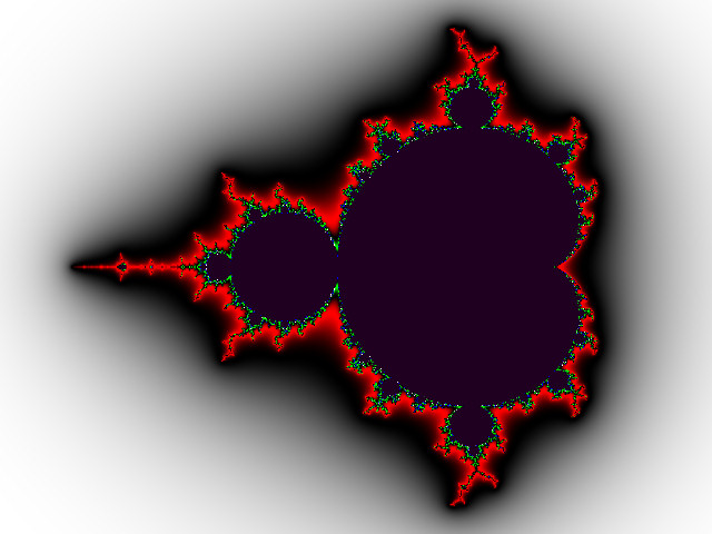
As an example, below is a typical Red-Green-Blue-White (RGBW) palette that I use a lot for basic exploration and testing of color mapping. The u values corresponding to each color are shown below the palette.
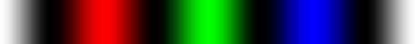 | ||||
| 0 | 0.25 | 0.5 | 0.75 | 1.0 |
Making the actual color palette itself is fairly straightforward. Each RGB color channel has a small set of control points (for example, there are nine in the RGBW palette above). The final full-color palette is just the combination of the three primary color channels, with some smoothing and interpolation between the control points.
This particular palette has the same color at u=0 and u=1 because it is designed to allow periodic color mapping, where the color map repeats itself over the image. This is described in more detail below.
The examples that follow all use the above RGBW color palette because it has sharply contrasting colors that are uniformly spaced. That makes it easy to see how the transformation in step 1 is changing things.
Periodicity and Palette Rolling
The two steps above will use the color palette exactly once; that is, as u increases from 0 to 1, each color in the palette will be used only one time. Often, it is desirable to have the color palette spanned more than once in the image. Also, sometimes we would like the color palette to be shifted so that color 0 applies to a count value other than the one corresponding to index 0. When this is done as a function of time, it gives a "rolling" effect to the color palette.
To make this happen, we can apply the following transformation to the index from step 1 before using it to get a color in step 2:
u = FRAC (u * P + Q)
P is the periodicity, or the number of times the palette will be repeated. Q is a phase-shift that gives the color-rolling effect if it is varied as a function of time. FRAC(x) means taking the fractional part of x; that is, subtracting the integer part of x leaving just the part after the decimal point.
Count Distribution
Before looking at the various ways we might map count numbers to color palette indexes, we should consider the following graph showing how the count numbers are distributed in a typical image. This turns out to have an enormous impact on how images look and is the most important thing to consider when mapping counts to colors.
The horizontal axis is the raw fractal count value, and the vertical axis is the number of pixels in the image that have that particular count value. So this is very much like a probability density function for the count values. Note that the horizontal axis (counts) has a logarithmic scale; this is something we have to do quite often to visualize the data better.
There are two traces on this graph. One (the red) represents the count distribution when the maximum iteration limit (also called maxiter, maxcount, etc.) is 100; the other (blue) is with the iteration limit at 10000.
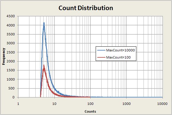
The main thing to notice here is that the vast majority of points have counts well below 100, even when the maximum count limit is 10,000. That is, most of the pixels in the image have count values at the low end of the possible range of counts. This fact will have a major influence on the choice of the best mapping from counts to color index--how the map function behaves at low count numbers will have more visual impact than how it behaves at high count numbers. We'll see how this works below.
Next we will consider several common mapping methods. The first three turn out not to work very well, but they are easy to understand and fairly common, so they deserve some discussion. The histogram above gives a lot of insight into why the first three coloring methods below end up not working very well. Two more sophisticated coloring techniques are discussed later and turn out to work quite nicely.
Linear Mapping
The simplest way to convert counts to a color index is a linear mapping. If N(x,y) is the count value at the coordinates (x,y), then the color index u is calculated like this:
u = (N(x,y) - Nmin) / (Nmax - Nmin)
where Nmin is the minimum count value in the image and Nmax is the maximum count value in the image.
This generally doesn't work very well unless the maximum count number is relatively low (like 100). For higher max counts, like 10,000, which is typical of the count range needed to get good deep-zoomed images, all the higher counts get crammed against the edge of the set and the mapping causes most of the pixels in the image to be colored near color 0.
Here are some examples:
 |
 |
| 100 counts | 10K counts |
The following graph shows the linear count map plotted with the count number on a logarithmic scale. The horizontal axis is count number and the vertical axis the the color index.
We can see that this map uses most of the color palette for counts above 1000. The color index range from 0.1 to 1.0 corresponds to counts 1000 to 10,000. Since only a very few pixels actually have counts greater than 1000 in this image, most of the color map is wasted. We can see this effect in the example images -- nearly all of both images is just white, corresponding to u-values around 0 to 0.1.
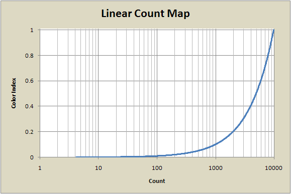
One way to handle this is to use a periodic mapping, as described above, using a P value of maybe 10 to get 10 cycles of the color palette in the image. For some images this works fairly well, but most of the time it turns out not to. A better solution is to try maps that rise more quickly at low count values. The next two maps (root and log) are examples of this.
Root Mapping
One way to make a map function that rises more quickly at low count values than the linear map is to take a root of the count value, like the square root. This helps bring the higher numbers down to lower values, which visually has the effect of moving some of the colors near index u=1 out away from the edge of the set and into the rest of the image.
The fully-scaled transformation map looks like this:
u = (Root(r,n)-Root(r,min)) / (Root(r,max)-Root(r,min))
Root(r,x) refers to taking the r-th root of x, which can be adjusted in software to give square root, cube root, etc., or even fractional roots like r=2.6.
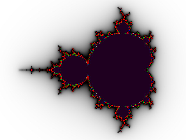
Here are some examples with the escape count limit set to 100:
 |
 |
 |
| Square root | Cube root | Fourth root |
This does utilize the color palette better than the linear mapping. You can see there is much more red, corresponding to u-values around 0.25, and even a little green (u=0.5) visible at the edge of the set. But notice that there is only a trace of the blue-white part of the color palette (color index above 0.75) . This is an improvement over the linear map, but the color palette is still not being utilized very efficiently -- about half of the available colors are hardly used at all.
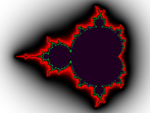
Here is what happens when the escape count is 10K:
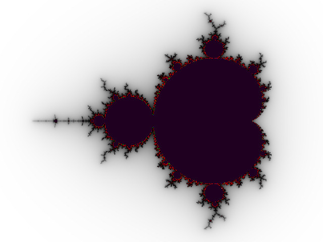 |
| Fourth root, 10K counts |
Although this is noticeably better than the linear map with 10K counts, we can see that this still utilizes only a tiny fraction of the upper half of the color palette. Only a few pixels are colored green, and no blue or white pixels are visible near the edge of the set.
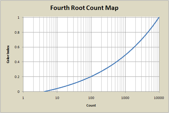
The following graph shows the fourth-root map. It has a much less sharp turn than the linear map does, so it spreads the counts out more toward the lower-indexed colors, but still favors the very infrequently-occurring counts at the highest end of the count range. Eighty percent of the color index range (u=0.2 to 1.0) is used for counts above 100, which are only a small fraction of the pixels in the image.
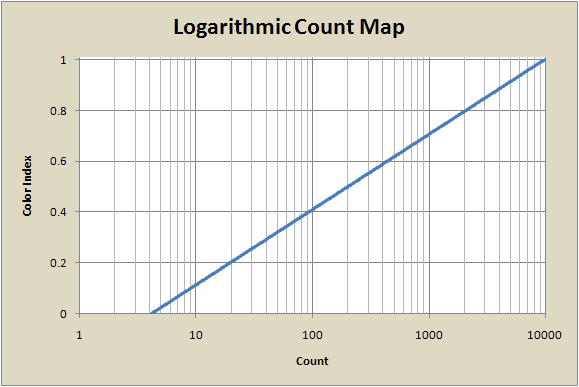
Logarithmic Mapping
While the root-based maps seem to help somewhat in spreading the colors more uniformly around the image, they still don't do a very good job. This is because the distribution of counts is more like an exponential function, so a logarithmic mapping is really what we should use. Logarithms rise even more slowly than algebraic roots do, so this should work better.
There are many ways to create a color index from 0 to 1 using the count number N, but this form turns out to have some nice properties:
u = (Log(N) - Log(Nmin)) / (Log(Nmax) - Log(Nmin))
= Log(N/Nmin) / Log(Nmax/Nmin)
= LogB(N/Nmin), where B=Nmax/Nmin
Interestingly, we can see that the base of the logarithm used in the intermediate calculations turns out not to matter. The logarithm of N ends up being taken to base B (as defined above), regardless of the base of the intermediate logarithms. This is one nice feature of this form of scaling. Another nice feature is that this function has no discontinuities or undefined values for any N>0, whether N<Nmin or N>Nmax, which helps scaling palettes for animations.
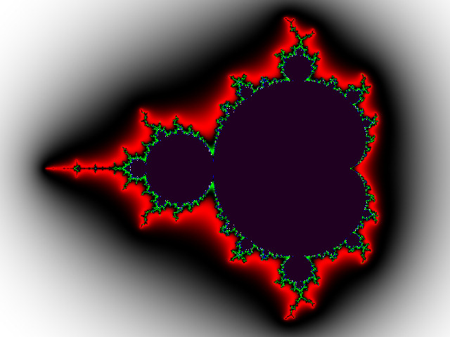
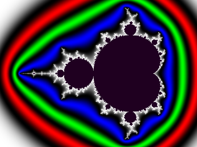
Here are examples with the escape count limit 100 and 10K:
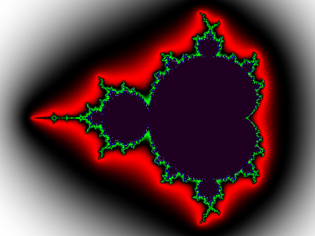 |
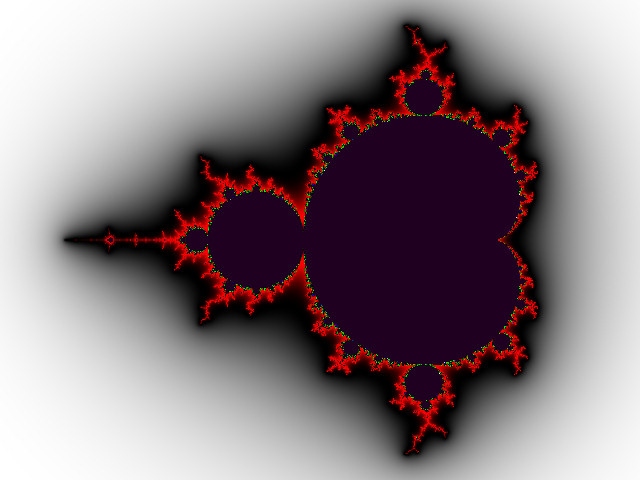 |
| 100 counts | 10K counts |
This is a big improvement over the linear and root mappings. In the 100-count case, we see a bit more blue and even a few white pixels near the set (near u=1.0 in the color map). However, once again, when the maximum iteration limit is increased to 10K, the vast majority of pixels have counts that are much smaller than the maximum count, so most of the image is, once again, colored with colors near u=0 in the color palette.
The improved balancing of colors compared to the linear and root maps can be seen in this graph. The mapping on this semi-log plot is a straight line. This rises faster at low count values than any map based on algebraic functions like roots, and might seem like an optimal shape, but if we recall that most of the pixels have very low count values, we see that this map still doesn't utilize the colors as well as they could be.
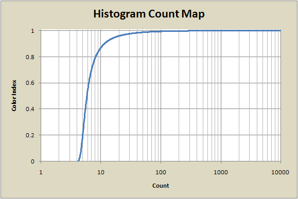
Histogram Mapping
Histogram mapping is a much more complicated way to map colors into the u=[0,1] interval than any of the previous methods, and it gives far superior results.
The idea is to generate the histogram H(n) of the distribution of all the count numbers in an image, convert it to the corresponding cumulative distribution
J(x) = Sum[H(i), i=0 to x]
and use the resulting J(x), appropriately normalized, to map counts to the unit interval.
u = J(x) / NUM
where NUM is the total number of points in the image (outside the set)
This effectively spreads out the color palette according to the distribution of counts in the image, and the color palette is utilized much more evenly, regardless of the range of counts:
 |
 |
| 100 counts | 10K counts |
Not only does histogram mapping spread out the colors more evenly than the previous mappings, but it also results in there being almost no difference between the images when the count range increases by a factor of 100. This is very desirable when making animations, where the count range can change by large amounts over the course of the video as mini-Mandelbrot sets come in and out of the video frame.
The reason for this robustness is that the rate of change of u with respect to n, du/dn, is very small for large values of n. In fact, this slope approaches 0 as u approaches 1. This is quite different from the previous mappings, where the slope du/dn was quite large for high values of n.
The graph below illustrates this. Once again, the horizontal axis is the count number in the image, and the vertical axis shows the value that will be used to index the color gradient. We saw above that most of the counts in this image are below 100, and we see here that this map will assign most of the color palette to counts below 100.
Histogram mapping does a great job of evenly spreading the color map over the image, ensuring that each color is present in almost exactly the same number of pixels as every other color (see the section below for histograms demonstrating this).
Whether this is esthetically pleasing in a given image is another question. Often, this method works very well, but sometimes, detail gets lost near the edges of the set since all counts at the high end of the range get mapped to nearly the same color.
Rank-Order Mapping
This mapping technique is similar to histogram mapping, but a little different. Instead of using a histogram of the count data, it uses a rank-ordered list to generate the mapping function. The list is made by sorting the count data from low to high, and map values are assigned to a count simply based on the count's position in the list. The lowest count is assigned to u=0, and the highest count is u=1. The 25th percentile color goes to u=0.25, the median color goes to u=0.5, etc. Counts are mapped to a color value directly proportional to their position on the list, regardless of how many times that value occurs.
Like the histogram map, this map distributes the colors quite evenly, although it assigns more of the color palette to higher count values than the histogram method does, resulting in more contrast in the higher count range, which means more detail is visible. This map is also quite robust against changes in high count numbers, like the histogram map. Note that the N=10K image is nearly identical to the N=100 image.
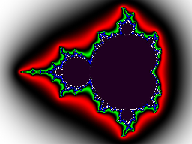 |
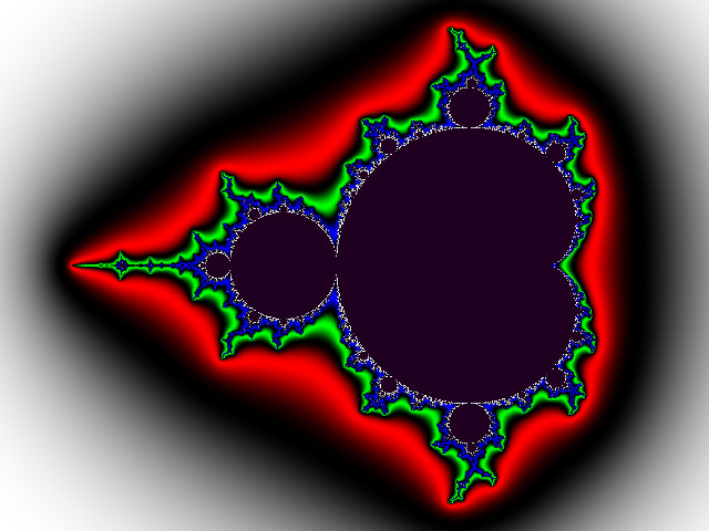 |
| 100 counts | 10K counts |
The resulting map function is similar to the histogram map function, but the rank-order map doesn't rise as fast, so it doesn't assign as much of the color palette to the lower count numbers. This is why there is more detail visible at higher count numbers than there was with the histogram map.
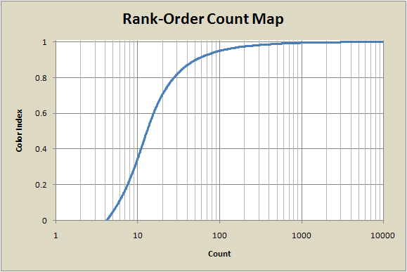
Depending on how the counts are distributed, the histogram map and rank-order map can give images that are quite different or nearly identical. The two maps are clearly related since the process used to generate them is similar. It turns out that the rank-order map is the same as the histogram map but with repeated count values ignored. So if the image data has a large number of different count values with no repeats, the histogram and rank-order maps will be the same. This effect is shown in one of the example images in the next section.
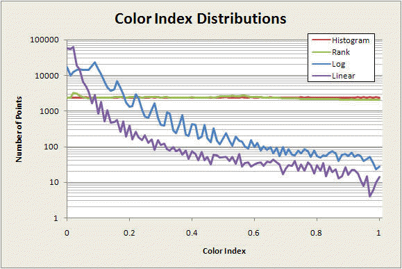
Distribution of the Color Index
Each of the mappings described above produces a particular distribution of colors in the image. The graphs below show how evenly (or not) four of the maps utilize the color palette. On each of these graphs, the horizontal axis is the color index and the vertical axis is the number of pixels in each of the two test images that have that color value.
The first graph was made with a square 500x500 pixel image of the whole Mandelbrot set, centered at (0,0) with a width and height of 4 in the complex number plane. The count limit was 200.
The histogram map (red) clearly distributes the colors exactly uniformly over the image. The rank-order (green) and log (blue) maps perform similarly, although the rank-order map utilizes the higher-index colors a bit more. The linear map (purple), as we've seen, fills most of the image with low-index colors.
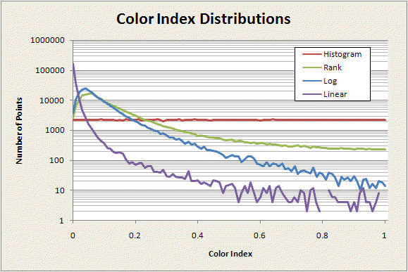
The next set of graphs is taken from the image in the third row of the anti-aliasing demonstration images. For this image, which has many more individual, slightly different, non-repeated count values than the previous example, the difference between the rank-order and histogram methods is much less, just barely discernible on the scale of this graph. The rank ordering list is almost identical to the cumulative distribution of the counts, so the color distributions are nearly the same. As before, the log and linear maps do not balance the color utilization as effectively as the rank-order and histogram methods do.
Fractional Counts
Just as important as how counts are converted to colors is how the counts are preprocessed before ever getting to the color map. All iterative fractals (whether convergent or divergent) generate integer values as their fundamental output at each image pixel. Very often, these integer values span range so narrow that the smallest possible difference between them (which is of course 1 for a set of integers) is fairly large compared to the range of counts. That results in areas of the image all being the same color, with no smooth gradient.
Here are two images that illustrate this effect.
 |
 |
| Linear map | Logarithmic Map |
These images represent exactly the same fractal data (calculated with a count limit of 100) but have different color maps. The linear map shows the banding effect in the gradient of white levels approaching the set. The logarithmic map makes the effect more obvious, but both images contain exactly the same fractal data.
These bands are caused by the fact that the fractal data is a series of integers; each color band corresponds to a particular integer value of the fractal data. The bands are sometimes called "dwell bands."
Fractional count generation is a way of making the fractal data values change smoothly across the dwell bands, resulting in a smooth gradient appearance. There are many possible ways to do this, but the most commonly used method works like this:
N' = F * (N + W * dx)
where
N = original integer count number
N' = modified count number
F = scale factor (typically 100 or 1000)
W = weight (typically 1.0)
and
dx = [log(log(ESC)) - log(log(|Z|))] / log(A)
with
Z = orbit point (in the complex number plane) at end of iterations
|Z| = magnitude of Z = Zr2 + Zi2
ESC = escape threshold radius (something very large works best)
A=exponent in the iterated polynomial (2 for the Mandelbrot set)
This method has been known for a very long time. It is based on the potential function described by Douday and Hubbard in 1982, and its use for generating continuous escape-time colorings was described in Peitgen in The Science of Fractal Images in 1988.
An Implementation Detail
One drawback to this is that since my software uses 32 bit integers to represent counts -- even the adjusted fractional counts -- the scale factor limits the maximum iteration count that I can use. The maximum value for a signed integer is 2,147,483,648, so the maximum escape count limit I can use with F=1000 is 2,147,483. This is far more than enough for most purposes, but very rare fractals require more counts to render properly, which means I have to reduce F to make room for the extra count digits, which reduces the smoothness of the gradient effect. Perhaps in the future I will change the way the fractals are internally represented, but for now I am stuck with this limitation.
All content Copyright by Michael Condron. All rights reserved unless otherwise noted.
You may download, save, and print a single copy for personal use only.
Music by various sources used with permission.
Please refer to individual video file credits for details.
